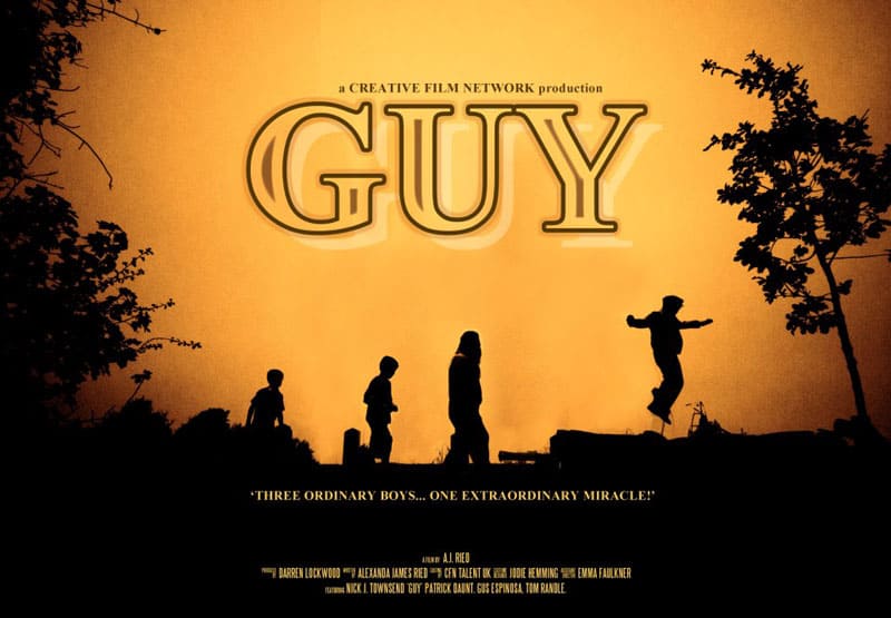
On Sunday I did a specials shoot for the Creative Film Network’s upcoming family feature, Guy.
With a 5:30am start, we wanted to catch a glorious sunrise cresting the hill of our chosen location in Moseley Bog (the very same bog alleged to have inspired legendary Lord of the Rings author, J.R.R. Tolkien for his vision of, ‘The Shire’).
It seemed we were in luck as there wasn’t any hint of rain as we set out with our lights and cast (it has to be mentioned that they did well to put up with being out in the freezing weather in their period costume which included shorts for some of the unlucky boys!)
When we got there it soon became clear that the sky wasn’t going to offer us anything to work with; it was completely flat and grey. We decided to shoot a variety of shots with the hope that we could try different approaches to the edit to create something that wouldwork.
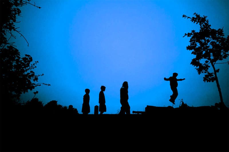
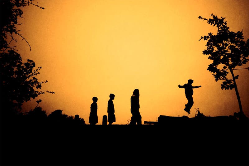
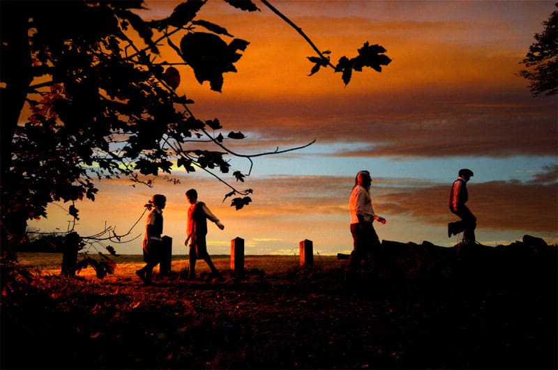
The first shot we knew we wanted was a silhouette of the cast walking across the hill top for the teaser trailer. Below is the original shot followed by the finished edit.
As the sky was so cold I simply swapped out the blue for a bright autumnal orange to get a much more appealing contrast and to warm it up a bit.
We then went on to try a few more different setups of the same shot, the first being one lit with a single flash head off camera left with an orange gel on it to give the illusion of a rising sun:
Unfortunately the sky still left a lot to be desired, so after some fiddling and the use of a stock sunrise provided by Fox Stox on Deviantart.com, the final result was this:
I really like how this has turned out. The little bit of extra light has given the image a little more depth and the gel and added sky has left the image feeling warmer and more autumnal.
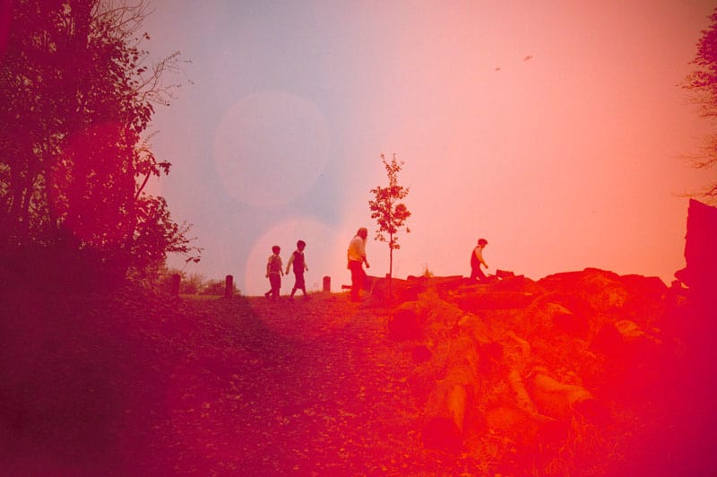
Our final setup for this shot was to try moving the gelled light immediately to the front left side of the camera so that it aimed across the lens rather than at the cast. I wanted to see how the shot would appear with lens flaring and colour haze from the gel seeping in. I took quite a number of shots at slightly different angles to produce a variety of results with the flare/haze but I feel this is one of the better shots.
With very minimal tweaking (curves/level) this is pretty much straight out of the camera. To me, this shot feels more like a production still rather than a specials shot as you can see more movement from the characters. I also like the slightly wider focal length that tells us more about the location as well as the flare giving the shot a look of out of date film.
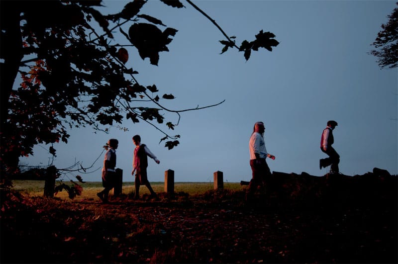
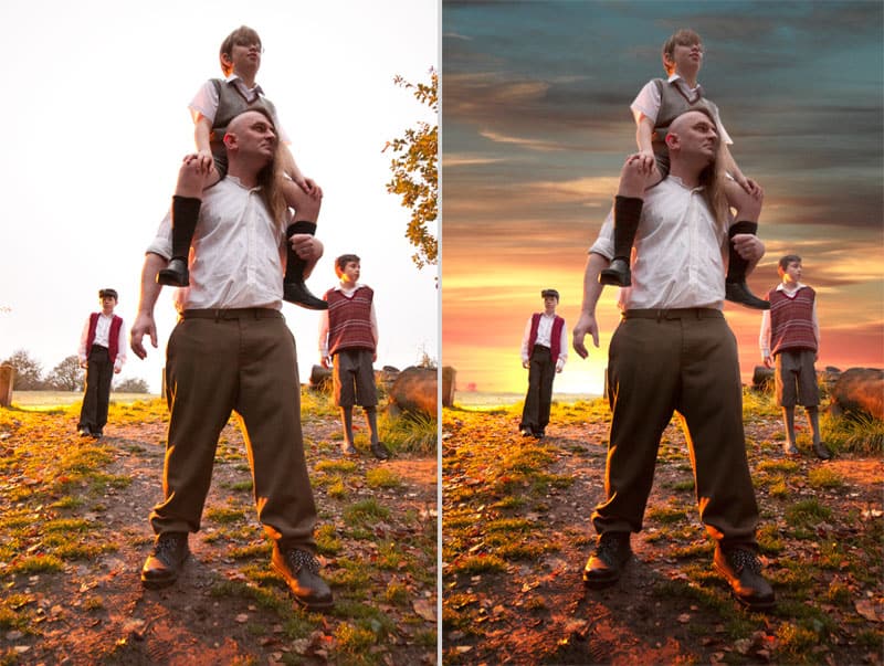
Whilst we were happy with obtaining the shots we had set out to, whilst we were there we tried one more alternative set up. This time the cast were walking towards the camera rather than across. Again I set the light and orange gel off camera left and behind the cast so that a warm glow lit both the ground as well as giving them a backlit look so that when we added in a stock image sun, it would look more believable.
Below is the original shot followed by the final edited version.
This sunrise was kindly provided by Deviant Artist, Elven Sheep Stock.
Despite being a freezing cold morning, the boys were great and everyone mucked in and as a result we had a great shoot with great images. Later that day we headed over to The White Room Studios for more specials. Images will be on the site shortly!

